I'm taking a Digital Darkroom class right now. Basically, I'm learning the non-chemical, very basic way photo processing happens in a darkroom, and then learning how to accomplish that digitally. One day, I want to work in a real darkroom. But that will most likely happen after I graduate and become a booming success. For now, I will be content with the crazy amount of notes I'm taking, and making on-purpose changes to my images.
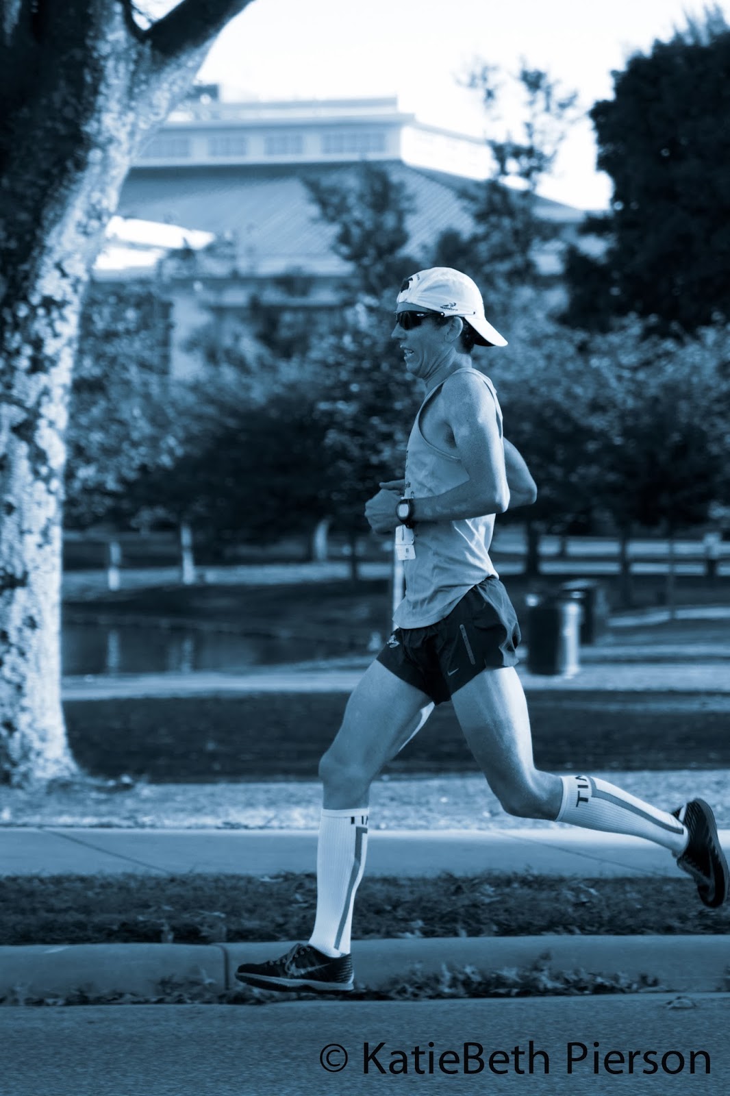
Did you know that black and white images are a relatively new thing? When photography first came out, images did not print in true black and white. There was always a tint or tone to them. The tints and tones varied based on the chemicals used. Our eyes tend to see them as black and white because we just don't see the many colors of the rainbow in one image. Consider the following image:
This image is not black and white. It is tinted with a very slight purple hue, mimicking a selenium effect. Selenium is subtle, and can appear to be purple, brown, yellow, or even blue. I chose purple in this image because the temperature was just above freezing during this race. The purple tint just seemed appropriate.
Have you ever heard of a cyanotype? Chances you have seen the effect at least once; this is true if you have seen a blueprint. Cyanotypes are a style of processing images where the print is blue, white, and black. You can see an example below:
As you can see, the blue isn't really a "true blue". There is a little bit of green in it, making the overall color cyan. This really isn't my favorite processing type, but I had to use it in this week's assignment. So here you go!
Most people love the sepia toned images. And I am no exception. I love the warmth, the immediate aged-look to the image, the feeling that the moment was quiet, and the image was taken during "the good ole days". Here is an example of an image with sepia tones:
But black and white images are lovely as well. Even though they are relatively modern, they still evoke certain emotions and feel like time is slowing down for the viewer of the image (even if it isn't happening for the subject of the photograph). Here is a true black and white image; one with absolutely no hue involved, and all colors in the photograph have been desaturated to a greyscale:
See the difference? Now go back to grandmas and look through her photo albums. What colors are those "old black and whites"? Which processes were used to print the image?
For a view of these images in full color (as well as the rest of the images I shot), please go to
my SmugMug gallery. The Spooktacular 5K was a blast to shoot, and even more fun to witness. Maybe next year, I'll run it!
Oh, and I almost forgot the last style of color toning: split toning. I can choose the tones of the highlights and shadows of an image to create some really dramatic images. Some people use split toning to create highlights and shadows in the same color temperature (warm vs cold). In the following image, I created a color scheme that had warm highlights and cold shadows. What do you think?
Being that the sun was rising when the race started, the warm highlights just make visual sense to me. But you had to be there to know the cold that was present that morning. The sub-freezing temperatures made me wonder why I was out there to shoot the race to begin with! So I chose to put cold blue shadows in the image to give that unsettled feeling. The results are dramatic, and very vibrant!